education
Basics of Technical Analysis
What is Technical Analysis
Technical Analysis is defined as the study of the market itself through the analysis of price action with the use of charts forecasting future price movement.
Technical analysis can be viewed as a combination of applied social psychology and statistics, like poll taking.
The objective of technical analysis is to detect trends and changes in crowd behavior and to express that information in a quantifiable manner in order to make intelligent trading decisions.
Technical analysis is based on three premises of the Dow Theory:
1. “Price discounts everything”, that is, all fundamental information, public or non-public, are already reflected in the price.
2. “Price tends to move in trends”, that is, price movement is not random, and one can determine its general direction.
3. “History repeats itself”, that is, human psychology has an impact on price and human psychology has repetitive patterns that can be exploited by knowledgeable traders.
Technical Analysis Category
Modern day technical analysis can be categorized into either classical chart analysis or computerized technical analysis.
Classical Chart Analysis
- Makes use of trend lines to detect potential areas of support and resistance.
- Employs price gap interpretation, candlestick patterns, one day reversals and volume expansion or contraction as tools of the trade.
Computerized Technical Analysis
- Makes use of computer software to construct technical indicators. Technical indicators are basically mathematical interpretations of price movement and are usually depicted in graphical form.
- More objective than classical chart analysis; main drawback is that indicators are sometimes giving contradicting signals.


Types of Charts
Charts are the main tools of technical analysis and currently, there are five chart types available to the modern-day trader.
These five chart types are the OHLC or bar chart, the Japanese candlesticks, the line chart, the mountain chart and the point and figure chart.
Charts are used to show the opening price, the highest price, the lowest price and the closing price. The opening price is the starting point of your chosen time frame. The High is the point which shows the maximum power of bullish traders while the Low shows the maximum power of bearish traders. The closing price is the standing price at the end of your chosen time frame. Each of these components tells a story of the bears and the bulls. For example, if the close is higher than the open and the close is near the high, then it goes to show that the bulls trampled the bears during that time frame.
PSS trading platform only supports the line chart, OHLC or bar chart and the Japanese candlesticks as these are the most commonly used chart types.
Line Charts
- The simplest and most basic chart type.
- Plots only one of the types of prices – be it the open, low, high or close. Most traders use the close because it is considered to be the most important.
- The main flaw of the line chart is that it does not tell the story of the bears and the bulls because it only focuses on the high, the low or the close.
- Has a limited use although some traders prefer using the line chart when using certain indicators such as the moving average.
OHLC (Open High Low Close)
- Commonly referred to as the bar chart.
- The most commonly used chart type.
- The positioning of the opening and closing price tells the story of what happened between the bears and the bulls within the bars.
Japanese Candlesticks
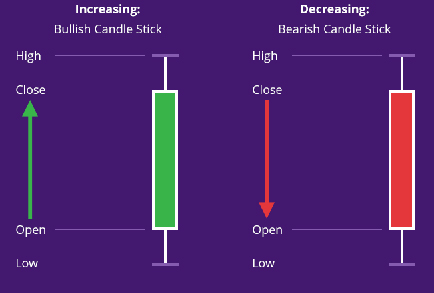
- Allegedly used by Japanese rice traders since the late 1800’s.
- Its popularity is due to the fact that the Japanese candlestick visually represents if the bears or bulls won during the previous candlestick. It also provides information about the opening price, the highest, the lowest and the closing price and the closing price.
Bullish candlesticks are usually displayed as white, while bearish candlesticks have black bodies. - It also consists of four major prices: high, low, open, and close. If the close is above the open, then a hollow candlestick is drawn.
- Whereas, if the close is below the open, then a filled candlestick is drawn.Commonly referred to as the bar chart.
Trend Lines and Trend Channels
Classical chartists use trend lines to try to determine areas of support and resistance.
The classical way to draw an uptrend trend line is by connecting two previous troughs with a line. If the line is pointing up, then there is an uptrend. In order to validate the trend line, price must touch the trend line and bounce up again. A more advanced technique is the use of trade channels. To create an uptrend channel, connect first the two most recent troughs and then draw a line parallel to it, but this time connecting the most recent peaks.
The classical way to draw a downtrend trend line is by connecting two previous peaks with a line. If the line is pointing down, then there is a downtrend. In order to validate the trend line, price must touch the trend line and bounce down again. A more advanced technique is the use of trade channels. To create a downtrend channel, connect first the two most recent peaks and then draw a line parallel to it, but this time connecting the most recent troughs.
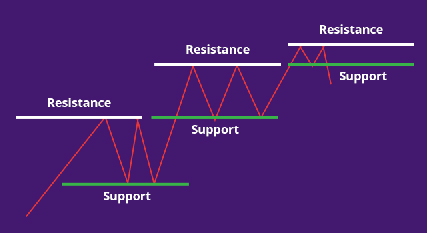
Concept of Support and Resistance
Support
Support is the price level at which demand is thought to be strong enough to prevent the price from declining further. The logic dictates that as the price declines towards support and gets cheaper, buyers become more inclined to buy and sellers become less inclined to sell. By the time that the price reaches the support level, it is believed that demand will overcome supply and prevent the price from falling below support.
Resistance
Resistance is the price level at which selling is thought to be strong enough to prevent the price from rising further. The logic dictates that as the price advances towards resistance, sellers become more inclined to sell and buyers become less inclined to buy. By the time that the price reaches the resistance level, it is believed that supply will overcome demand and prevent the price from rising above resistance.
Things to remember about trend lines and channels
- A trend line which has been tested five or more times is reliable and a break of this trend line is a significant event which probably signals a reversal.
- Trend channels which have high volatility are more reliable and are harder to break.
- It takes enough volume to break resistance areas but it does not take enough volume to break support areas.
- Trend lines and trend channels should ideally have a 45-degree angle, otherwise, they are considered too weak or too unsustainable.


Identifying Patterns
Patterns, also known as Area Patterns, are pictures, shapes or formations which appear on price charts and can be easily recognized by those who are familiar with them.
Price Patterns can be categorized into either Continuation Patterns or Reversal Patterns.
Continuation Patterns, as the name suggests, are Area Patterns which indicate a short pause if the trend is about to stop and that trend is ready to continue its direction.
Reversal Patterns, on the other hand, are Area Patterns which signify that the current trend is about to end and that change in direction is about to take place.
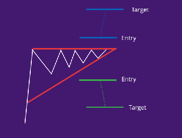
Ascending Triangle
Formed when prices begin to consolidate into such a pattern that drawing support and resistance lines results into a right triangle where connecting all the peaks produces a horizontal line while connecting all the troughs results in a rising trend line. This area pattern is bullish in nature because it implies that bulls are pushing prices up while bears are pushing them down at the same resistance levels. It would only be a matter of time before the bulls overwhelm the bears and a breakout to the upside occurs.
Symmetrical Triangle
Formed when prices begin to consolidate into such a pattern that drawing support and resistance lines results into a symmetrically shaped triangle. The symmetrical nature of the support and resistance lines implies that there is balance between the bears and the bulls and, as an extension, a break to the upside is just as likely as a break to the downside.
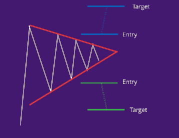
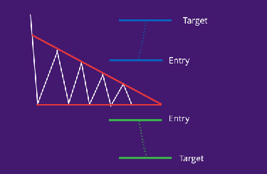
Descending Triangle
Formed when prices begin to consolidate into such a pattern that drawing support and resistance lines results into a right triangle where connecting all the peaks produces a falling trend line while connecting all the troughs results in a horizontal line. This area pattern is bearish in nature because it implies that bears are pushing prices down while bulls are pushing them up at the same support levels. It would only be a matter of time before the bears overwhelm the bulls and a breakout to the downside occurs.
Reversal Patterns
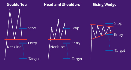
Head and Shoulders Top
The most well-known, well-loved and most reliable reversal area pattern is currently known as Head and Shoulders Top. The ingredients for a valid head and shoulders top include a prior uptrend, a left shoulder with heavy volume followed by a dip then a rally to a new high but with a lighter volume than that at the left shoulder. This is then followed by a dip which goes near the most recent low; then a third rally with even lighter volume which fails to reach the same height as the most recent peak; then a dip with prices closing below the neckline which also, in effect, completes the head and shoulders top area pattern. A pullback which does not exceed the neckline validates the head and shoulders area pattern.
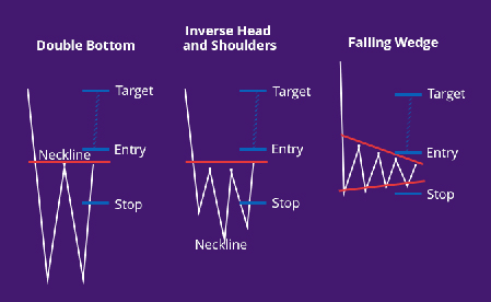
Inverted Head and Shoulders
This is known as the mirror image of the head and shoulders top. The main difference between a head and shoulders top and an inverted head and shoulders is the significance of volume. Volume is more significant in an inverted head and shoulders because an expansion in volume is a prerequisite for an upward movement of price.
Double Top
More common than the head and shoulders but just as reliable, is the double top formation. The first top is formed when there is a new high and therefore a new peak, which is normal in an uptrend. The second peak is formed when bulls tried to push prices above the most recent peak but failed due to heavy resistance. The pattern is completed when bears overcome the bulls so much so that prices break past the most recent low.
Double Bottom
The mirror image of the double top. Volume is more significant in a double bottom area pattern because an expansion in volume is a prerequisite for an upward movement of price.
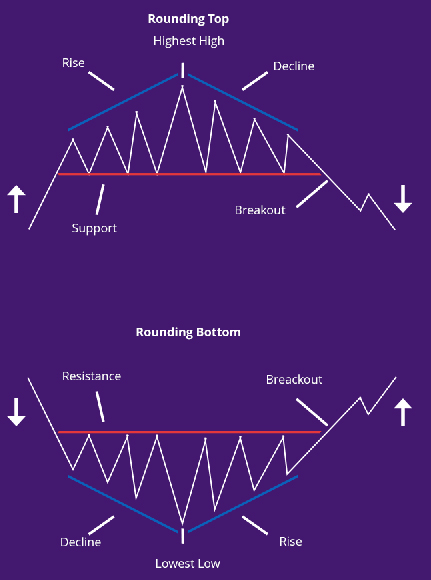
Rounding Top and Rounding Bottom
Long-term area patterns that are most prominent when using a weekly or monthly chart. These area patterns are generally difficult to detect and even more difficult to trade. One thing that is almost certain about these area patterns is that if they took a longer time to form, then the trend which follows after their completion is more significant, and larger, and longer. It is a matter of time before the bears overwhelm the bulls and a breakout to the downside occurs.
Sources: www.wikipedia.org / www.corporatefinanceinstitute.com / www.businessdictionary.com / www.readyratios.com / www.moneycrashers.com